
Rolling Inferno
Overview-
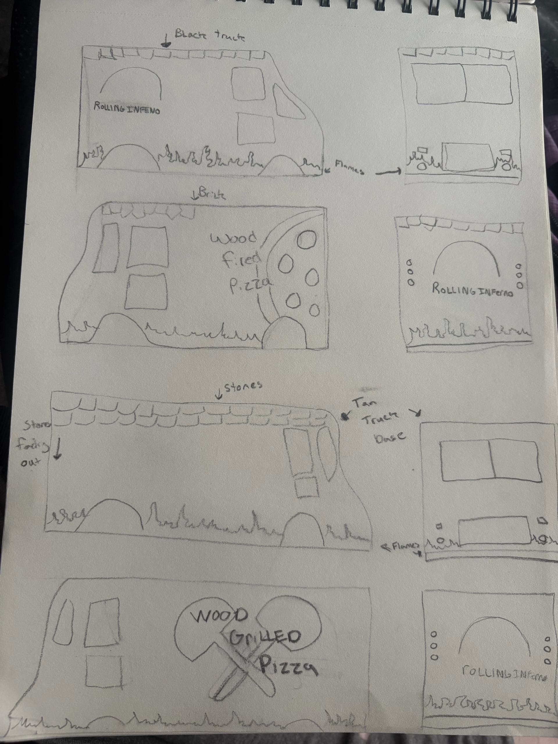
The goal of this project was to create a strong, memorable logo for Rolling Inferno, a mobile wood-fired pizza business. The logo needed to reflect the authenticity of traditional wood-fired pizza while capturing the bold, energetic personality of a modern food truck.
The Challenge-
One of the biggest challenges was creating a logo that felt unique without losing the visual cues people associate with wood-fired pizza. I wanted the design to stand out while still being instantly recognizable.
Design Process-
During the design process, I explored concepts that moved beyond the traditional brick oven. While some ideas were more original, I found they weakened the connection to the brand. I ultimately chose to incorporate the brick oven because it immediately communicates authenticity and the wood-fired cooking process.To make the logo feel distinctive, I combined realistic details with a simplified, slightly illustrated style. This balance helped create a design that feels approachable, memorable, and professional. The logo was created using Adobe Illustrator, allowing me to build clean, scalable vector artwork.
Final Outcome-
The final logo features a stylized brick oven with a glowing flame paired with bold typography. The combination of realism and illustration creates a warm, inviting identity that reflects both the craftsmanship of wood-fired pizza and the energetic personality of the brand.
Reflection-
This project reinforced the importance of balancing creativity with clarity. While it's exciting to explore unconventional ideas, I learned that the strongest branding often comes from combining originality with familiar visual elements that audiences immediately understand.


Rooted App.
Overview-
Rooted is a plant care app designed to make caring for houseplants simple and organized. Many plant owners struggle to remember watering schedules or quickly find basic care information. The goal of this project was to create an easy-to-use app that helps users keep their plants healthy without feeling overwhelmed.
Problem-
Plant owners often forget when to water their plants or have trouble finding reliable care information. Existing apps can include too many features, making them confusing for users who simply want reminders and quick care guides.
Target User-
This app is designed for everyday plant owners who want an organized way to manage their plants. Whether someone owns a few plants or an entire collection, Rooted provides simple tools that make plant care easier.
My Role-
I completed the entire design process, including user research, wire-framing, interface design, prototyping, and visual design using Figma.
Process-
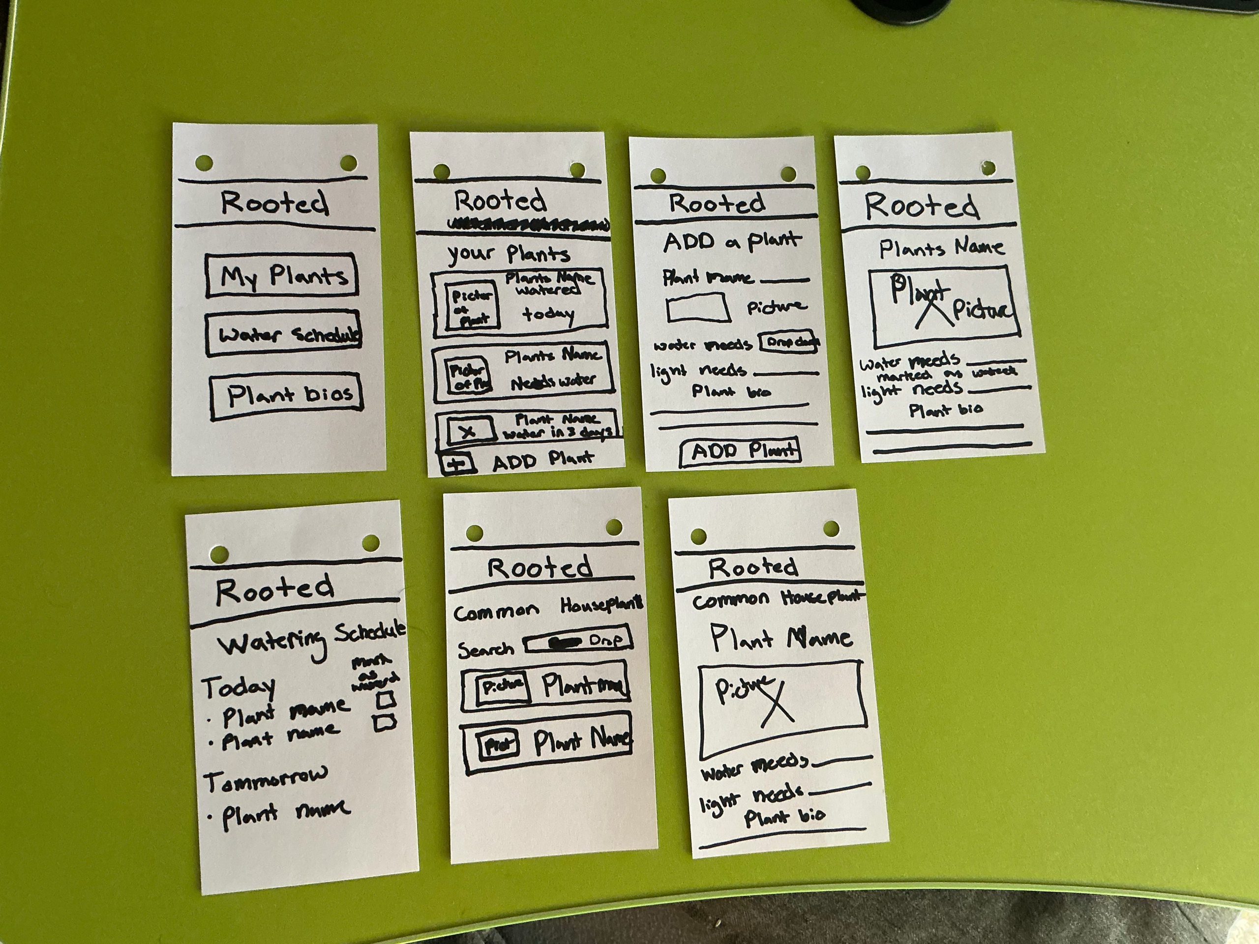
I began by researching common challenges plant owners face and creating wireframes to organize the app's navigation. After developing the interface in Figma, I tested the design, gathered feedback, and made revisions to improve usability and simplify the overall experience.
Design Decisions-
One of the biggest decisions I made was keeping the app focused on only the most important features. During the design process, I removed ideas like plant disease diagnosis because they added unnecessary complexity. Instead, I focused on watering schedules, plant profiles, and basic care information so users could complete their tasks quickly. I also used a calming green color palette, simple icons, and consistent layouts to make the app feel approachable and easy to navigate. Throughout the project I refined the navigation and improved screen layouts based on usability feedback to create a cleaner experience.
Outcome-
The finished prototype provides a straightforward experience that allows users to add plants, view care information, and stay on top of watering schedules. By focusing on the essential features, I created an interface that feels organized, approachable, and easy to navigate.
Reflection-
This project strengthened my understanding of the UX design process and showed me how user feedback can improve a design. It helped me become more confident using Figma while reinforcing the importance of creating simple, intuitive experiences that make everyday tasks easier for users.


The Purrfect Blend


Overview-
This project focused on creating a logo for Purrfect Blend, a fictional cat café that combines coffee and cats in a fun and welcoming environment. The goal was to design a logo that clearly represented both parts of the brand while remaining simple, memorable, and visually balanced.
Concept & Challenge-
This was the second logo I created during my design studies. One of the biggest challenges was creating a cat illustration that felt friendly, recognizable, and approachable. I also struggled to create a composition that felt balanced. My original design didn't include a border, but after reviewing it, I realized the artwork looked unfinished and needed more structure.
Design Approach-
I created a simplified cat illustration using clean lines and bold shapes, then paired it with a coffee mug and rising steam to reinforce the café theme. As I refined the design, I experimented with different layouts before adding a rounded rectangular border. This helped frame the artwork, improve the overall balance, and create a more polished logo.The final color palette combines a black background with an orange cat illustration, a blue coffee mug, and white typography. The contrast helps each element stand out while giving the logo a playful, welcoming personality.
Final Outcome-
The finished logo brings together the themes of coffee and cats in a clean, memorable design. The combination of illustration, typography, and color creates a friendly brand identity that fits the atmosphere of a cat café.
Reflection-
This project showed me how much refinement can improve a design. Through multiple revisions, I strengthened both the illustration and the overall composition. It reinforced that small design decisions, like adjusting shapes or adding a border, can have a big impact on creating a cohesive and professional brand identity.
Infographic

Overview-
This project focused on designing an engaging infographic that clearly communicates the ingredients and steps for making a Tequila Sunrise. The goal was to present the information in a way that was both visually appealing and easy to follow.
Concept & Challenge-
As a beginner using Adobe Creative Cloud, one of my biggest challenges was learning how to use multiple programs together effectively. I also needed to organize a large amount of information within a limited space while maintaining a clean, readable layout.
Design Approach-
I created a custom vector illustration of the drink in Adobe Illustrator to give the infographic a unique and cohesive look. I then used Adobe InDesign to organize the layout, focusing on visual hierarchy, spacing, and readability. Throughout the design process, I worked to balance text and visuals so the information was engaging without feeling overcrowded.
Final Outcome-
The finished infographic uses warm, vibrant colors and a well-organized layout to guide viewers through the recipe. The combination of custom illustrations and thoughtful typography creates a design that is both informative and visually engaging.
Reflection-
This project helped me build confidence using Adobe Illustrator and InDesign together. I strengthened my understanding of layout design, information hierarchy, and visual communication while creating a design that is both attractive and easy to understand.
Surreal Picture

Overview-
This project focused on creating a surreal digital composition by combining multiple images into a single imaginative scene using Adobe Photoshop. The goal was to create a visually convincing composition while exploring creativity through photo manipulation.
Concept & Challenge-
As a beginner using Photoshop, one of the biggest challenges was blending images from different sources so they appeared to belong in the same environment. Matching lighting, color, perspective, and scale required careful adjustments throughout the design process.
Design Approach-
Using Adobe Photoshop, I experimented with layers, masks, blending modes, and color adjustments to unify the composition. Through trial and error, I refined edges, balanced the lighting, and adjusted colors to create a seamless transition between the fantasy elements and the background.
Final Outcome-
The final piece presents a dreamlike scene where multiple images work together to create a visually engaging composition. The combination of natural and surreal elements creates a balanced design that encourages viewers to explore the artwork.
Reflection-
This project strengthened my foundational Photoshop skills and taught me the importance of patience and attention to detail when creating digital composites. It also improved my confidence in solving visual challenges and building imaginative designs from multiple source images.
Color Psychology Explainer Animation
Overview-
This project is a short explainer animation about the emotions and meanings associated with different colors. The goal was to present this information in a visually engaging way while using motion to reinforce each color’s emotional impact. I also aimed to create something that could be understood even without sound through the use of captions and clear visual sequencing.
Design Process-
I began by organizing the content into a simple structure, introducing one color at a time to keep the information easy to follow. From there, I explored different animation styles and transitions to find a pacing that felt smooth and engaging.One of the biggest challenges was maintaining viewer interest throughout the entire video. I experimented with timing, movement, and transitions until I found a rhythm that felt intentional and supported the content.Another challenge was creating a multicolored box animation. It took several attempts to refine the movement and timing, but through iteration I was able to achieve a result that felt dynamic and visually satisfying.
Outcome-
The final animation presents color psychology in a clear, engaging sequence with smooth transitions and supportive motion design. The multicolored box animation became a key visual moment that helps tie the piece together.
Reflection-
This project strengthened my confidence in motion design and taught me the importance of pacing, timing, and iteration. It also reinforced that technical challenges often lead to stronger outcomes when I continue experimenting instead of settling on the first solution.


